Speak with authority, quality is trustworthy.
Speak with authority, quality is trustworthy.
We know how to match colors. We also want to decorate our home a wonderful comfort home. How do you do it?
First of all, you have to master some color knowledge, and look at some color matching cases. As long as you improve your color knowledge and aesthetic level, you can complete the magic of space deformation, making your home look twice as big.
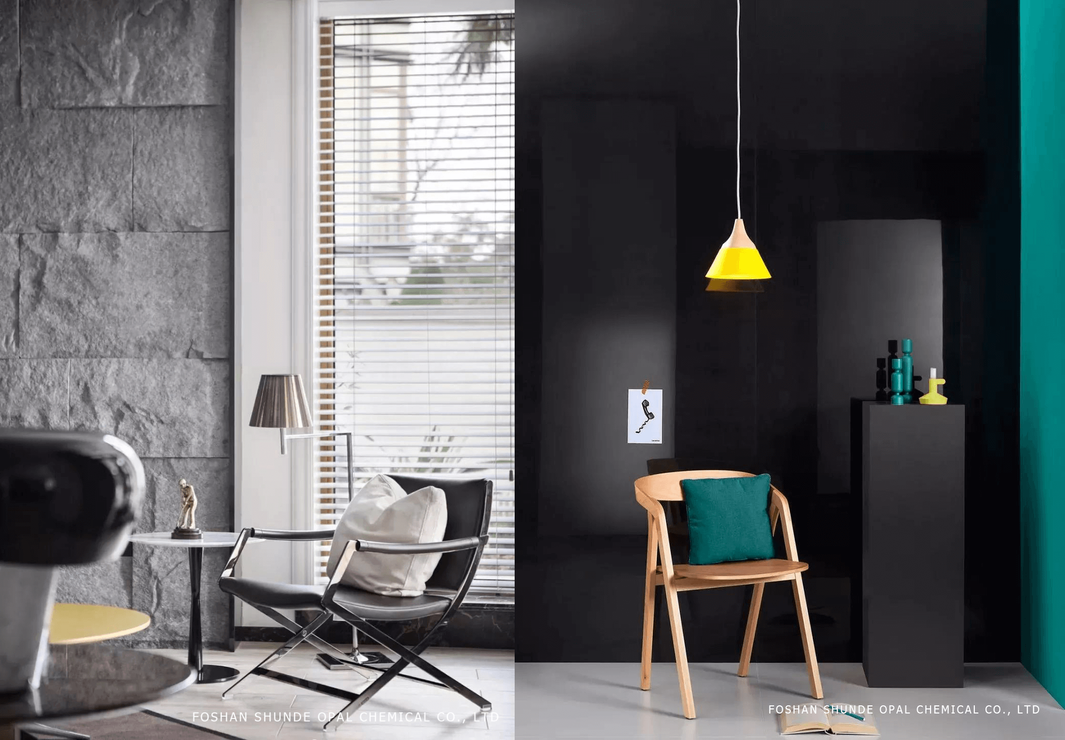
1.Try to use low-purity colors as much as possible
The recent popular black and white gray cold wind is low purity. In the home, high-purity colors are best not to be used in large areas.
From a health point of view, they make the eyes overburdened. If you stare at them for a long time, they will easily cause dizziness, irritability, irritability and other consequences. From the taste, they are difficult to match. Large-scale use is easy to cause aesthetic fatigue, and it is easy to let The home style has become rustic.
2.Use color to change the visual space
In fact, the color can also change the size of the space visually, so with the right color, your home may be 20 square meters. The low purity, high brightness, and cool hue color can enlarge the space.
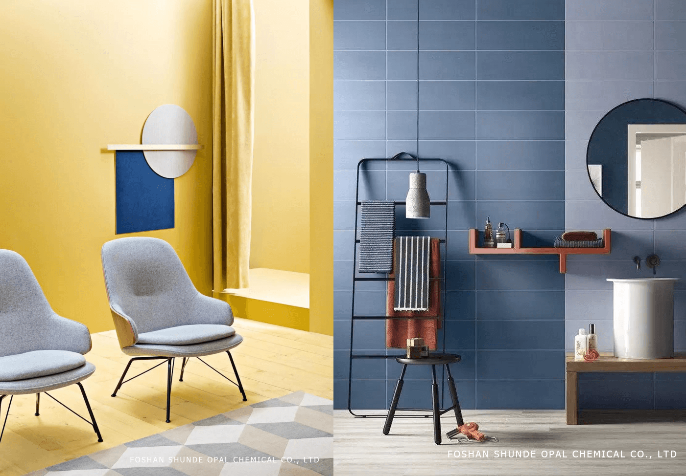
The high purity, high brightness, and warm hue are the swelling colors, such as bright yellow and orange red. They look like the sun and glow, which makes the small space more crowded and hot.
The light color has a rising sense, and the dark color has a falling feeling. Therefore, the height of the room, you can use the light color on the top, the ground and the furniture to use dark colors, forcibly open the visual distance between the top and the ground.
3.Control the amount of space color
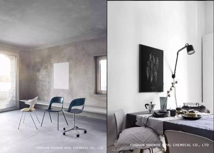
The reason why black and white ash is so popular is that everyone gradually knows that for home design, simplicity is beautiful. However, simplicity does not mean that it can only be selective and cool colors.
Colors are relatively easy to match, and it makes sense for people who don't have much color matching experience. However, the lack of color can make the space look very rich in three-dimensional or need skill, because in addition to color, we must also consider the pattern, material and other factors.
Here are a few color schemes that can be used to make home design more advanced and textured.
Morandi/Color: the highest state of soft assembly color
The so-called "Molandi color" is not a high-grade gray, the picture is peaceful and natural, soothing and elegant, there is a static harmony beauty, in fact, it is now called "sexual cold" style.
The color is simple but not monotonous. Although it loses the intensity and intensity of the original saturation, it is softer and more elegant. It is very high-grade and gentle when used well in home decoration.
Because the gray cold temperament is difficult to control, it is easy to create a feeling of bluntness and coldness when it is not well matched. It lacks the sense of life and is easy to produce a sense of distance.
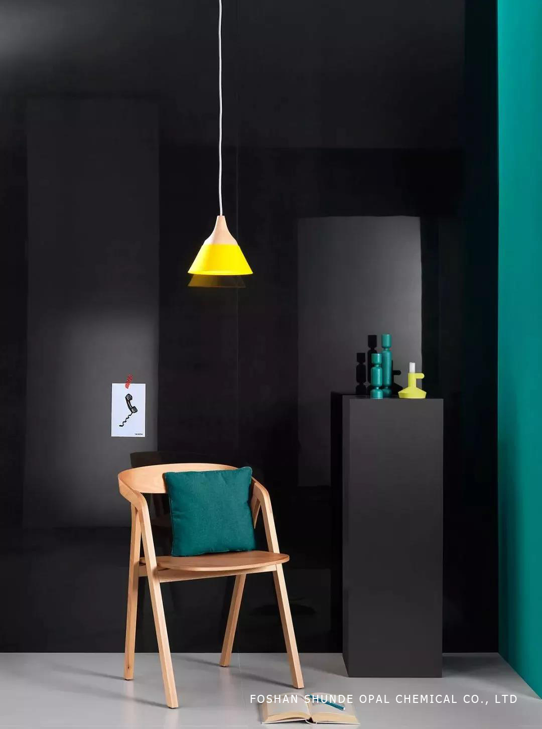
If you really think that the gray is a bit monotonous, then use the lighting of the stylish accent, to bring the unparalleled visual effect with the luster, and make the moody space become advanced and stylish.
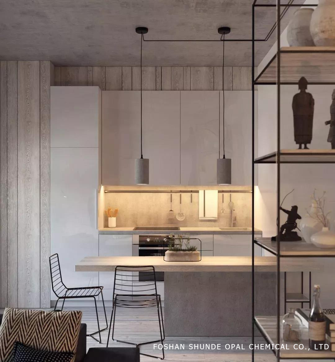
Some people say that the best-selling business men love this color matching kitchen. The gray is inherently low-key and heavy, which coincides with the gentleman's temperament.
Pure gray will create a sense of space expansion, and the texture of cement has a little retro industrial atmosphere.
If you don't know what color bed you want to buy, the gray color will not be wrong. The effect is better than those cartoon characters and the big peony of the Republic of China.
Through these examples of matching, you will find that the personality of high-grade gray is not low-key, it is pulling our emotional symbols, sometimes elegant and moving, and not at all.
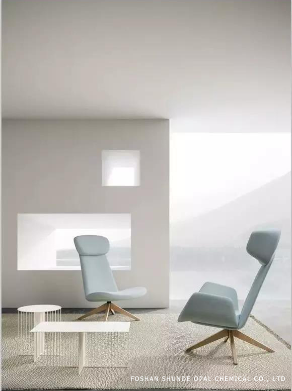
Blue/color:that touch of deep and elegant style
Quiet, noble, deep, romantic... Blue brings a lot of beauty to people.
When the pure blue temperament is stunningly presented in the living room, what you feel may not only be the elegant atmosphere of the face, but also a very quiet living atmosphere, which gives the impetuous heart a free release space.
The baby blue background is matched with the beige color home, and the combination of lightness and steady texture brings a natural grandeur. And the combination of relaxation and relaxation is to show the comfort of a comfortable home.
The ocean wind space is suitable for more light blue furniture, and the romantic soft tones soften the overall color of the visual sense, rendering a romantic atmosphere.
The contrast between blue and orange contrasts can bring us the speed and passion of color. In the bright sea blue, we add high-definition orange. The coexistence of bright colors keeps our eyes tight, and the high emotions keep the space. The rhythm of Yuet.
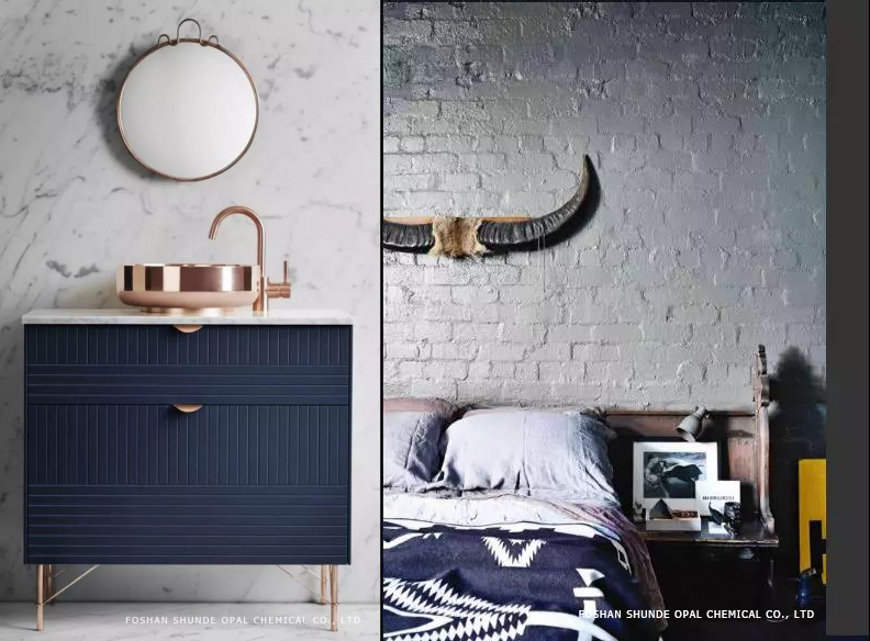
The royal blue with a high brightness can also bring a stunning effect. And the blue bed cover makes the room with white walls, white doors and light wood floors look deep and quiet.
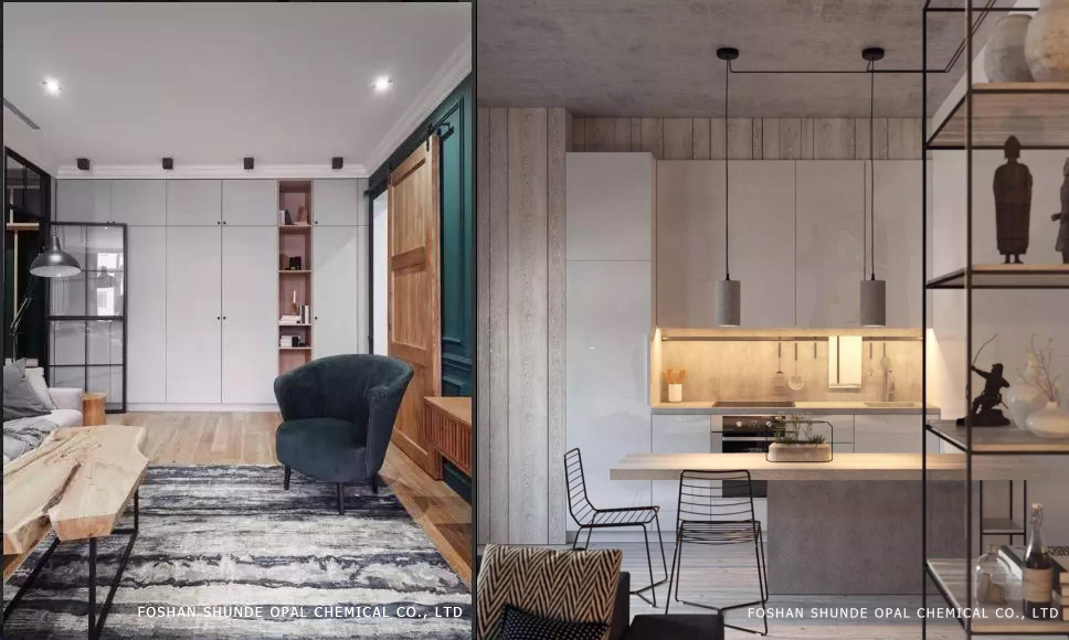
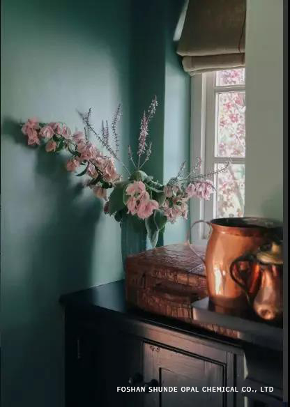
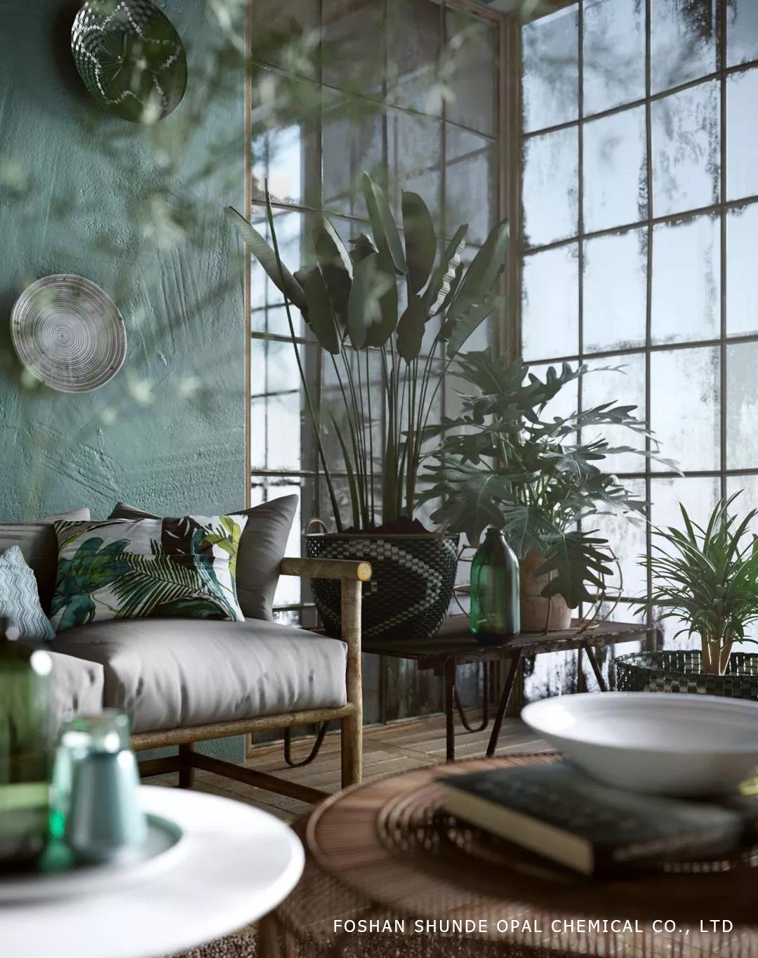
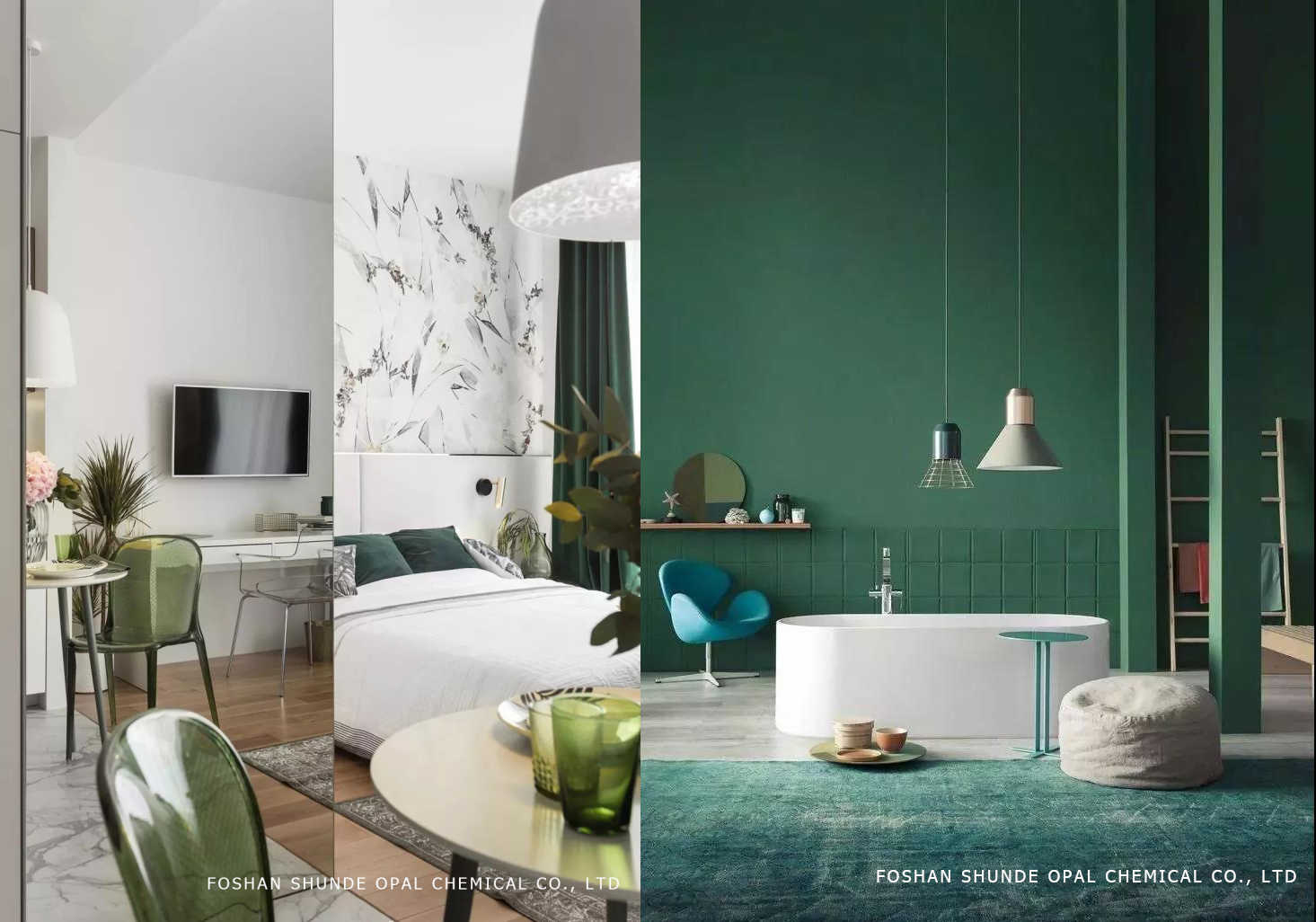
Green/color:from the fashion world to the new darling of the home industry
Color psychologists have long pointed out that people will feel calm in short-wavelength colors (such as green), and more excited and excited in long-wavelength colors (such as red and yellow).
This phenomenon may have occurred in the process of human evolution. Because for the hominid, the green environment means plenty of food and water, the positive feeling of green is integrated into the brain during evolution and is preserved to this day.
Gray-light brightness and purity are relatively low, not green to thorns, but also bring a low-key, peaceful atmosphere to the space. More suitable for large wall color.

In addition to the large green walls, the furniture in the room can also echo, and the layering of the whole room is enriched.
Olive Green + Bright White is the most commonly used color combination in the design. With olive green as the background, with white curtains and sofa rugs, the light and clean colors bring a relaxed and pleasant feeling.
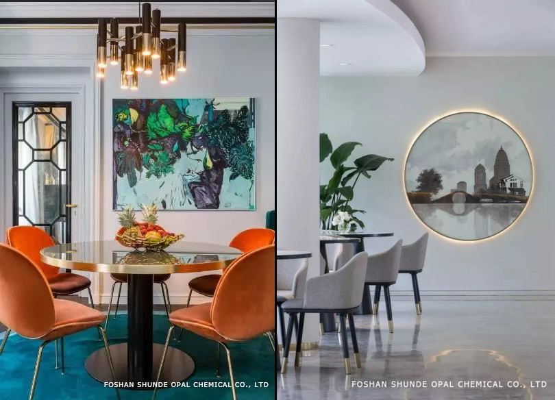
Among the popular colors of 2019, high-grade pink is undoubtedly the most attractive. Whether it is clothing or home, Amway has a large number of girls bursting.
Pink is more diverse, can be sweet and pure, can be romantic dreams, but also calm and determined. It is therefore often possible to see pink traces in the homes of people of different personalities.
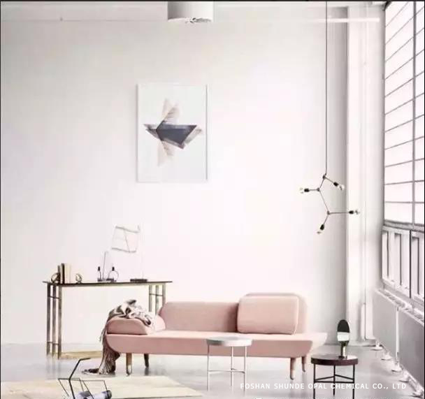
Although pink is not easy to take, it is easy to look cheesy, but in daily home, the appropriate pink not only affects the home, but also affects people's mood. After a long time, the mentality is bright and young.
As the ash of the wild king, it collides with the pink (light powder, glutinous rice) to create a modern sense.
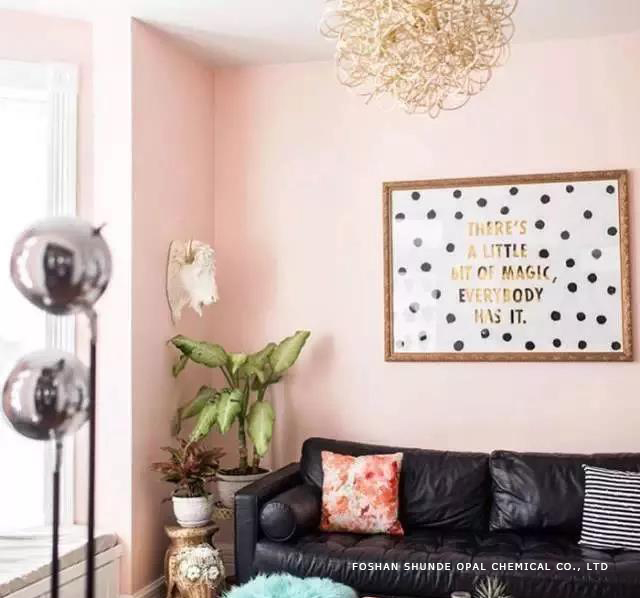
The black leather old sofa is matched with the pink environment, and the fresh and outgoing Nordic wind blows in. You are a special person.
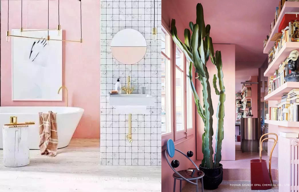
Brass objects are becoming more and more popular. In the choice of home decorations, brass is becoming the first choice, or the original color or rose gold. The metallic temperament of brass complements the pink color, bringing an elegant dream to the home.
Hot Line:+86 020-22818328
Customer Service: 400-678-6206 / E-mail: Master@weyes.cn
Office Add: The Entire Floor Of 5af And 30f Of Xingguang Yingjing Building, No.117 Shuiyin Road, Yuexiu District, Guangzhou City, Guangdong Province
Copyright © 2021 Guangzhou Weyes Network Technology Co., Ltd. | All Rights Reserved