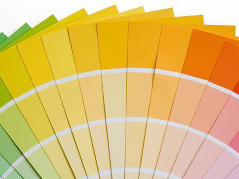
The higher the household paint color choice of heavy metal content in the coating color more bright-coloured
The higher the household paint color choice of heavy metal content in the coating color more bright-coloured
by:Opal2021-01-18
At present, many young people in the fashion and personalization in decorating their home choose color according to their personal preferences.
At the same time, in order to promote their individuality, and they use the color of the colorful painting the walls.
However, they are not aware that the brighter the color, the higher of heavy metal content in paint.
Many bright colored paint now contain a variety of heavy metals, such as lead or mercury.
Frequent contact with these heavy metals can cause poisoning symptoms such as dizziness, headache, insomnia and poor memory.
Use of color in living in adornment, decorate expert for beginners and the use of the commonly used color have some Suggestions.
1.
The color of children room should not be too bright.
If children often in indoor activities, it is easy to cause heavy metal poisoning, which may hinder the normal development of children nervous system.
2.
When choosing wall paint, should pay special attention to the quality and brand choice, but in terms of color, it is best to light color, don't be visual, this will also affect the spirit for a long time.
3.
Choose home decoration material is very important.
You must be careful when choosing paint, and pay attention to environmental protection.
Wall color had better choose light color, monochromatic is better.
Room air circulation should be strengthened, to avoid residual paint smell.
4.
When choosing a home decoration color, we often choose design according to his be fond of.
However, according to the principle of color, the color can't random matching.
In general, is not recommended in the same room there are three main color.
Like the color, use the right place can make our health of body and mind.
5.
Tangerine is a kind of warm color, has the vigor, vitality and vigor, can let a person feel excited, but is not suitable for choose the bedroom.
Otherwise, it is easy to influence people's sleep, so that they have been in the active state.
However, orange can be appropriately applied to the color of the sitting room, especially in the restaurant's color, bright orange can stimulate appetite.
6.
Many fashionable young people like to black and white tonal give priority to color space.
At the same time, black and white collocation can make the room look more modern.
However, if too much emphasis on black and white tone, people will become impatient and frustrated.
If they really like the collocation of two, they can make give priority to color to white, decorated with black accessories, make the room brighter and more tasteful.
7.
Blue has a calming nerves.
Blue is pure and fresh and elegant.
This is a kind of color can let a person think.
Blue belong to cool color system, however, should not be used at the restaurant.
Otherwise, it will reduce appetite.
Warm color is inferior to stimulate our appetite.
8.
Purple is always let a person feel dream, fragile and thin.
However, if used for home decoration, large areas of purple is not suitable for appearance.
It will make the room of the main color darkened, resulting in a depression.
It is not suitable for children room even.
Source: WWW.
baolialiqi。
com